5. Building Reports
This section provides step-by-step examples for building reports in PowerBI using SciForge data. Each example demonstrates a specific reporting scenario, including connector setup, credential management, M language integration, and data modeling. Additional examples and best practices are included to cover a range of laboratory reporting needs.
Example: Sample Receiving Volume Report
This example demonstrates building a report that visualizes the volume of samples received over time and the percentage of received samples that are billable.
Step 1: Define the Report Type
- Report Goal: Visualize sample receiving metrics for a given date range.
- Data Source: SciForge GraphQL endpoint (getSingleSampleReceiving query).
Step 2: Create the PowerBI Connector
- Open PowerBI Desktop.
- Create a Blank Report.
- Select Get Data and then Blank Query. This will open the Power Query editor.
Step 3: Parameterize Credentials
Power Query parameters can be used to centrally manage the ELabLIMS Application Key and username. This approach supports scheduled refreshes, service accounts, and avoids user-specific authentication issues.
How to set up parameters:
- In Power Query, go to Manage Parameters and then New Parameter.
- Create parameters for the Application Key (e.g., appKeyParam) and Username (e.g., usernameParam).
- Enter the values for these parameters.
- Reference these parameters in the M code as shown below.
Step 4: Add SciForge Authentication Scripts
GraphQL queries or mutations used to get meaningful data from the SciForge API can only be accessed with proper authentication. The Application Keys created in ELabLIMS are used to obtain a JWT token. That token is needed when requesting data from SciForge. This step details how to retrieve the necessary token.
The Power Query editor will have opened and created Query1 in the left pane.
- Right-click Query1 and select Advanced Editor. This will retain line endings and formatting.
- Add the following Power Query (M language) code to authenticate and retrieve data using parameters. Adjust the URL for the apiUrl.
let
getJwt =
let
apiUrl = "https://your-instance.sciforge.net/graphql",
appKey = appKeyParam, //uses parameter created previously
username = usernameParam, //uses parameter created previously
authBody = Json.FromValue([
query = "mutation {LoginAppKeyJWT}"
]),
authResponse = Web.Contents(apiUrl, [
Content = authBody,
Headers = [
#"Content-Type" = "application/json",
#"elab-key-auth" = appKey,
#"elab-user-name" = username
]
]),
authJson = Json.Document(authResponse),
jwt = authJson[data][LoginAppKeyJWT]
in
jwt
in
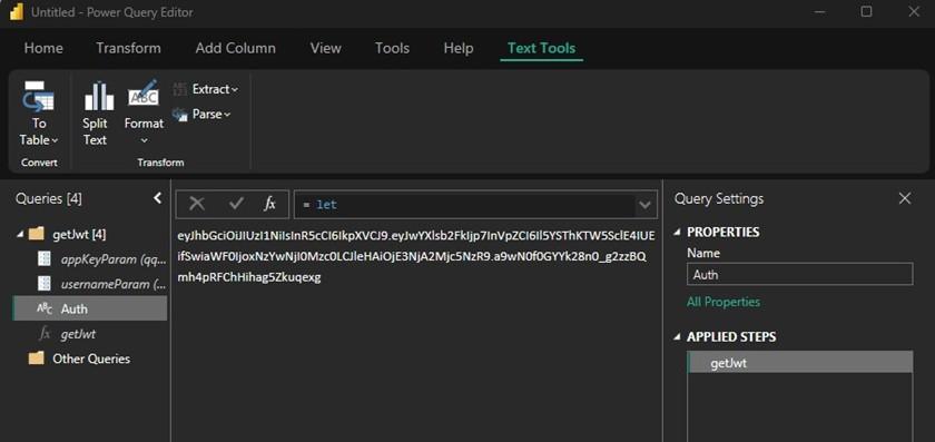
getJwt3. Press Done to exit the advanced editor. If all steps to this point have been followed and the credentials are valid, a JWT token should appear in the main pane.
4. Convert to function by right-clicking Query1 in the right-hand pane and selecting Create Function. Enter a name, such as getJwt. The use of parameters will be automatically detected.
5. Query1 can be renamed via right-click or in the right-most pane. In this article, it has been renamed to Auth.
SciForge queries can now use the JWT token returned by the new function to authenticate.
The PowerBI Power Query Editor should look like:
Step 5: Add SciForge Fact Table Queries
The JWT token from Step 4 will now be used to get data that will be used in PowerBI report visualizations. For the examples in this article, a single GraphQL query is used to support multiple visualizations.
- In the Other Queries section of the Power Query editor, add a new blank query and name it getData.
- In the Advanced Editor (right-click the new getData query), add the below M Script. Update apiUrl to the correct value.
let
apiUrl = "https://your-instance.sciforge.net/graphql",
jwt = getJwt(appKeyParam, usernameParam),
queryBody = Json.FromValue([
query = "query {
getSingleSampleReceiving(input:
{
SAMPLERECEIVEDDTSTART:""2025-04-01"",
SAMPLERECEIVEDDTEND:""2025-10-09""
}) {
SAMPLEID
SAMPLEGROUPID
SAMPLEDETAIL1
SPROGRAMTYPEID
BILLABLE
EDITEDDT
EDITEDBY
CREATEDDT
CREATEDBY
ASSIGNEDTO
Sample {
SAMPLENUMBER
SAMPLECOLLECTIONDATE
SAMPLERECEIVED
SampleDetails {
SAMPLERECEIVEDDT
}
}
}
}"
]),
response = Web.Contents(apiUrl, [
Content = queryBody,
Headers = [
#"Content-Type" = "application/json",
#"x-auth-token" = jwt
]
]),
result = Json.Document(response)
in
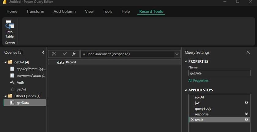
resultNote that the structure of the GraphQL queries and mutations within Power Query M Language are straightforward. Define the URL, get the authentication token, define the query and headers, and capture the JSON result. For those familiar with the PowerBI application, obtaining the desired GraphQL query results is often the most challenging step. This is best achieved in the SciForge Playground.
After exiting the Advanced Editor by pressing the Done button, the Power Query editor should look as shown:
Step 6: Model and Visualize the Data
In order to visualize the data, manipulation of the JSON result returned by the API call to SciForge is needed. In the screenshot at the end of Step 5, the result is basically shown as a one-column table with a single record. However, in the example used in this article, there are in fact over 500 sample records. Report visualizations will require the data to be formatted in a tabular fashion. Additional PowerBI features will also be needed to visualize the data over time and to present data effectively.
In order to build a report, common PowerBI activities can be expected to include:
· JSON data will need to be transformed into a table using Power Query’s To Table and Expand features.
· Data fields need to be of a suitable data type.
· For visualizations that will have an X-Axis of a time dimension, a Date Table is generally needed that has all dates present. A relationship to the appropriate fact table date column will need to be established, as well as a measure to aggregate data.
· Each dimension to be visualized needs a data field. For example, a pie chart cannot simply use a true/false column. Independent measures are needed to count the number of records that are true, and another for the number of records that are false.
· Once data is structured and typed as needed, report visualizations are created.
· Filters or slicers are added to reports as needed.
Steps to transform the JSON data returned from the SciForge API
(PowerBI Query Editor is still open from Step 5)
· On the getData query, for Applied Step result, click on Record in the center pane to expand it.
· Click on List in the center pane to expand it.
· In the top menu, select To Table from the List Tools menu. Leave the default values and press OK.
· A table with a single column will be shown at this point. In the column header, at the top is a double arrow to expand the column. Click that button. Select all columns.
· At the end of the table that now appears, the Sample column has an expansion button. Expand and include all columns, again.
· Finally, expand the SampleDetails column. This puts all JSON data into a tabular format.
· Adjust the data types of the columns. At the top of each column in the table, there is an icon with abc123 that indicates the data type is currently any. Click that icon. For examples in this article, at a minimum:
o SAMPLEID should be set to Whole Number
o BILLABLE should be set to True/False
o SAMPLERECEIVEDDT should be set to Date/Time
o CREATEDDT should be set to Date/Time
The Power Query Editor will now show: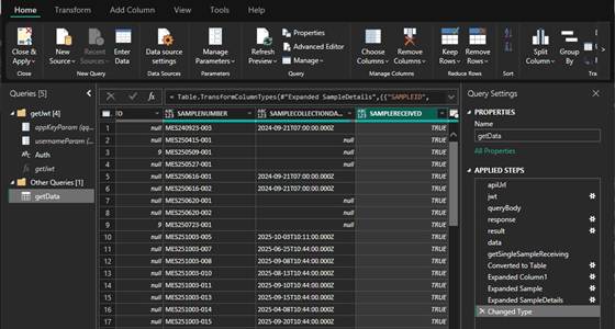
The transformed data may now be used to build visuals. Additional steps to manipulate the data are needed in PowerBI depending on the desired graphic.
Close and apply the changes made in the Power Query Editor. Further steps will occur in the main PowerBI user interface. The Data pane will be populated with the Auth and getData queries defined and configured up to this point.
Visualize receiving volume by week or by month
The first report examples create a line chart that has a date dimension (week or month) for the x-axis and a count of received samples as the y-axis. The GraphQL data source queries for samples that have been received between April and October of 2025. Since all data is already in a received state, the steps to build the report will not include PowerBI filters. This simplifies this section; in practice, reports will often require additional filtering.
Due to the x-axis requiring a date dimension, a Date Table is needed. A date table provides data points for each day, and a way for dates in the fact table to be aggregated in “buckets” of week or month. A short discussion can be found at https://whatthefact.bi/power-bi/dax/the-ultimate-guide-to-date-table-relationships-understand-relationships-with-a-date-column-an-integer-column-and-mark-as-date-table-in-power-bi-correctly/.
Once the Date Table is present, a relationship with the fact table (getData) is needed, as well as a measure that will be used to aggregate data (in this case, count records).
Steps to add the Date Table (in the main PowerBI user interface)
· From the top menu, select Modeling and New Table.
· To keep things simple, the table and columns will be added at once. Copy the below DAX into the editor that appears underneath the top menu.
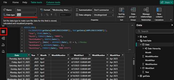
· In Table view, highlight the DateTable.Date field and set the Data Type to Date. It will default to Date/Time.
DateTable =
ADDCOLUMNS(
CALENDAR(MIN(getData[SAMPLERECEIVEDDT]), MAX(getData[SAMPLERECEIVEDDT])),
"Year", YEAR([Date]),
"Month", FORMAT([Date], "MMMM"),
"MonthNumber", MONTH([Date]),
"WeekStart", [Date] - WEEKDAY([Date], 2) + 1, //Monday
"WeekNumber", WEEKNUM([Date], 2),
"MonthYear", FORMAT([Date], "MMM YYYY")
)
A DateTable will appear in the Data pane. When viewed in Table View, a table of dates will be shown. The first date will be the minimum SAMPLERECEIVEDDT, and the last date will be the maximum SAMPLERECEIVEDDT. The data in various columns is calculated and generally self-explanatory, though WeekStart does use a formula to calculate the date of the Monday that starts the week.
Create Relationship to Fact Table
Before the relationship is created, a new calculated column is created that converts SAMPLERECEIVEDDT to a date from a date/time. The relationship, much like database joins, needs exactly the same data to form proper relationships. A date of 2025 Jan 1 is not the same as a date of 2025 Jan 1 at 10:00AM. A simple change to force the data type of SAMPLERECEIVEDDT to date is not sufficient.
· Select getData from the Data pane.
· In the top menu, select New column. Copy the below DAX into the editor that appears underneath the top menu.
ReceivedDateOnly = DATE(YEAR(getData[SAMPLERECEIVEDDT]), MONTH(getData[SAMPLERECEIVEDDT]), DAY(getData[SAMPLERECEIVEDDT]))
· Create a Relationship between the new table and data:
o Under Modeling in the top menu, select Manage Relationships.
o Select New Relationship.
§ From table: DateTable.Date
§ To table: getData.ReceivedDateOnly
§ Cardinality: One to many
§ Cross-filter direction: single
o Click Save and close the Manage Relationships dialog.
Add a measure to count samples
· Click on DateTable in the Data Pane.
· In the top menu, select New Measure. Copy the below DAX into the editor that appears underneath the top menu.
SampleCnt = COUNT(getData[SAMPLERECEIVEDDT])
The steps to prepare the data are complete. What remains is to create the reports.
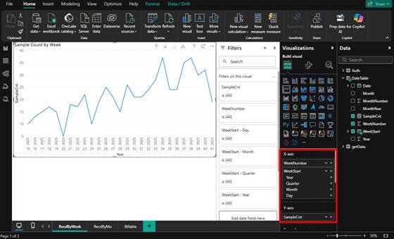
Create visual by week
· In the Report View, Page 1, select the Line Chart from the Visualizations tab.
· Add WeekNumber and WeekStart to the X-Axis.
· Add SampleCnt to the Y-Axis.
· Adjust formatting and rename report tabs, titles, and other elements as desired.
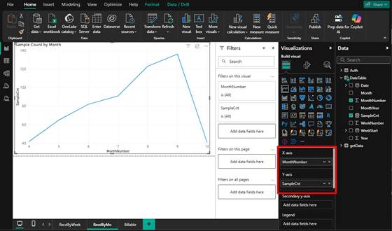
Create visual by month
This is a minor variation of the weekly report.
· In the Report View, Page 1, select the Line Chart from the Visualizations tab.
· Add MonthNumber to the X-Axis.
· Add SampleCnt to the Y-Axis.
· Adjust formatting and rename report tabs, titles, and other elements as desired.
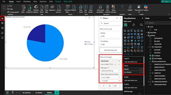
Visualize percent billable of receiving volume
This report will show a simple pie chart presenting data over a selectable date range using a PowerBI filter. Note that the original SciForge GraphQL query is filtering on a received date range, meaning that only samples that are received appear in the data set.
The BILLABLE column of type True/False cannot be used directly. A count of True values and another of False values will be used to populate the pie chart.
· Make sure data type of getData[BILLABLE] is set to True/False in PowerBI.
· Create new measures for Is Billable and NOT Billable on the fact table (getData):
Is Billable =
CALCULATE(
COUNTROWS(getData),
FILTER(
getData,
getData[BILLABLE] = TRUE()
)
)
NOT Billable =
CALCULATE(
COUNTROWS(getData),
FILTER(
getData,
getData[BILLABLE] = FALSE()
)
)
· On a new tab of PowerBI, add a Pie chart visual.
· Add the Is Billable and NOT Billable measures to the Visualization Values.
· getData.CREATEDDT should have been set to Date/Time in a prior step (Date also works). If needed, open the Power Query editor and adjust.
· Drag getData.CREATEDDT to the Filters on this page section. Use the advanced filtering option to select date ranges to filter on.